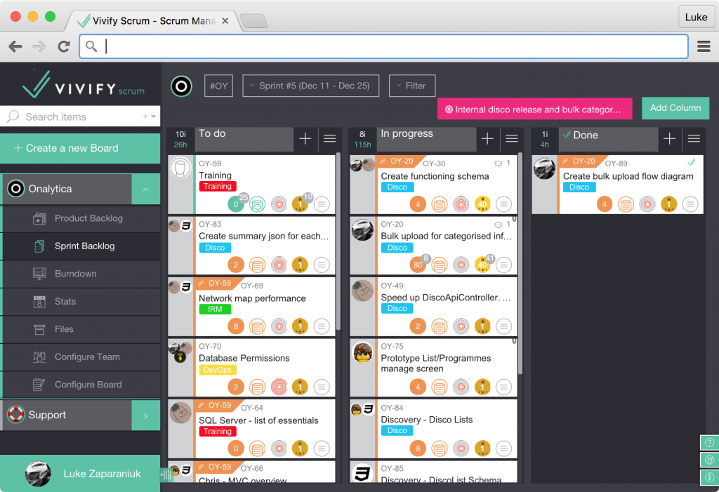
Here at Onalytica, we’ve been on something of a journey with our development management tools. We develop to the principles of agile development — specifically Scrum. We use to find engaging with our tools something of a challenge, so much so that we tried more than one before we stumbled across Vivify Scrum (or Vivify, as we refer to it). Since we began using it, our engagement and enthusiasm for organising and recording what we do has increased significantly. Let’s explain why.

We initially used Trello. Its structure is simple: you have boards, which have lists, which have cards. It’s well designed and very slick — a great example of a modern single-page app. It strives to be general, rather than specific, and this is its biggest weakness. You have, for example, complete flexibility around the the layout of your boards and how cards transition between your lists. However, Scrum provides a defined framework in which to work (backlog and sprint areas, to do, in progress, and done lists), and Trello being unopinionated, does not offer Scrum-specific functionality or productivity shortcuts to take advantage of this definition. Not only does this increase the amount of interaction required to achieve what you want, it also means that more effort is required to adhere to the Trello process, which in our experience, with tight deadlines and forgetful developers, often left our boards out-of-sync with reality.
Trello demarcates its cards at the board boundary. Because of this, it’s not possible to share card content between boards beyond simple hyperlinking. Although it is possible to move cards and lists between boards, we often found that we needed to do this whilst being able to access their content.
Back when we were using it, Trello didn’t have GitHub integration — but does now. This was also a consideration at the time.
Faced with these shortcomings, we turned to JIRA by Atlassian. It’s widely used within the industry (we’ve interviewed recently, and the majority of the candidates had used it previously). In comparison to Trello, it specifically targets development workflows. It’s also feature-rich, provides our desired card sharing, and has GitHub integration.
The immediate problem with it was the unavoidable requirement of having to read the documentation. Its huge feature set and customisability became an obstacle to even getting started. Their was the sense that decisions made at the outset would have irredeemable consequences further down the line. We face difficult decisions everyday developing our products; we felt our development management tool did not need to be another.
We were perhaps spoiled by the slickness of Trello because we found JIRA rather retro in how it handled user interaction. The Scrum project pages are a single-page JavaScript app, but JIRA has been around for a long time, and this history seems to cast a longer shadow over the UX. For instance, rather than being able to modify a card whilst looking at it, you need to explicitly hit the Edit button to make your changes. This mentality permeates the entire product and becomes even more apparent outside of the newer sections where postbacks roam free.
When we finally turned to Vivify, it was an instance success. Like Trello, it’s a modern web app with great flow and very little thought required to complete actions and navigate around. Like JIRA, it specifically targets software development. It also has GitHub integration!

As its name implies, it’s designed for Scrum workflows (although Kanban boards are also available; we use one for our support tasks). You have a product backlog that contains columns which become your sprints and a sprint backlog that holds just the cards you’ve assigned to that sprint. This provides our desired card referencing as you can view content between the product and sprint areas.
As the common interactions are known in advance (cards move between the backlog and sprint, cards get marked as done etc) the Vivify team have baked in various shortcuts: moving a card to the Done column automatically marks it as done; closing a sprint with incomplete cards creates an incomplete sprint column in the product backlog that keeps cards in their original columns; cards can be filtered based on their location within a card hierarchy (because cards can have parents and children, which is great for breaking out stories into tasks).

Vivify has just enough customisation without requiring a date with the documentation. You can specify item units (hours, points or whatever you want), default options, keyboard shortcuts, and you can add and remove columns to meet your specific requirements. We don’t give too much weight to these features, but you can also assign values and priorities to cards should you want more fidelity in your organisation strategy.
We have come across some pretty minor bugs, but after notifying the team at Vivify, they fixed them up for the following release. We like the product so much that we’ve submitted several suggestions for features that would enhance our experience yet further. The team have been great in implementing the majority of these!
We’re really glad we stumbled across Vivify (due to rather effective SEO). Based on our experience of other products, it makes up for and improves upon their shortcomings. It’s a pleasure to use, is easy on the eyes, and requires very little effort to get started. We’ve found that we have better understanding of exactly whats going, what needs to be done, and who is working on what, which ultimately is what you really want from project management software.
